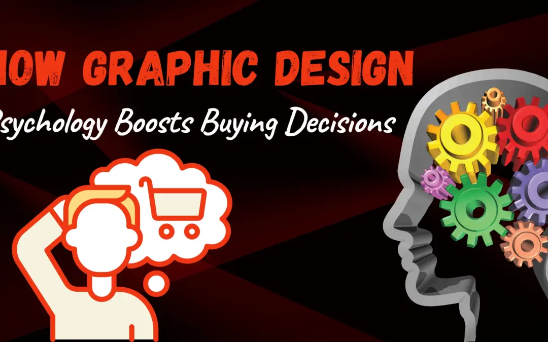
Graphic Design Psychology: How Colors and Shapes Influence Buying Decisions
Have you ever picked up a product simply because it looked inviting or felt right to you? Maybe a certain color caught your eye or the shape of the packaging made it stand out on the shelf. That’s not by chance — that’s the magic of graphic design psychology at work.
We appreciate how the smart use of colors and shapes can gently guide people’s choices without them even realizing it. Let’s explore how these subtle design elements can nudge customers toward clicking “buy” or filling their carts.
The Power of Color
Colors are like emotional shortcuts for our brains. They can instantly trigger feelings, memories, or moods. Here’s a snapshot of what some common colors tend to communicate, especially in marketing and design:
- Red: This color is energetic and grabs attention. It can create a sense of urgency or excitement, often nudging people to act quickly. For instance, clearance sales frequently use red to highlight deals. Think about brands like Coca-Cola or Target, which use red to stir up excitement and grab customers’ gaze.
- Blue: Blue is calming and trustworthy. People associate it with dependability and security, which is why you see banks and tech companies like IBM and Facebook using it. It’s a color that helps customers feel safe handing over their money or personal info.
- Green: Green brings to mind nature, health, and growth. Eco-friendly or organic brands often lean on green, like Whole Foods or The Body Shop, to suggest their products are good for you and the planet.
- Yellow: This bright shade feels optimistic and warm. It can draw attention quickly, which is why companies like IKEA use yellow to make their ads and stores feel lively and welcoming.
Picking the right color isn’t about liking it personally; it’s about deciding what feeling you want your audience to have when they see your brand.
The Impact of Shapes
Shapes aren’t just about looks — they carry meaning too. Different shapes can send subtle messages to your brain that influence how you view a brand or product:
- Circles: Round shapes generally suggest friendliness, unity, and softness. Brands that want to seem approachable and inclusive, like Spotify or Pepsi, tend to use circles or rounded edges.
- Squares and Rectangles: These shapes promise reliability and structure. They’re solid and stable, qualities that financial institutions or tech companies, like Microsoft or Adobe, want to reflect.
- Triangles: Sharp and dynamic, triangles often imply motion, direction, or risk-taking. Sports brands like Adidas use triangles in their logos to signal energy and progress.
So, when designing your brand’s visuals, think about what kind of “vibe” your shapes are giving off — they’re silently telling a story.
Real-World Examples
Seeing is believing. Here are some everyday brands using graphic design psychology to great effect:
- Target: Their red bullseye logo uses a vibrant shade of red combined with circles to create a feeling of excitement and inclusivity. You almost feel invited to be part of a community that shares good deals.
- Apple: Their famous minimalist style uses plenty of white space with clean, rounded corners on their products and website. This design screams simplicity, innovation, and luxury, making you feel confident that you’re buying a cutting-edge gadget.
Another example: Amazon’s use of a smile-shaped arrow from “A” to “Z” subtly promises customer satisfaction and everything you could want, creating a friendly, reassuring vibe.
Actionable Advice for Businesses
Want to tap into graphic design psychology yourself? Here’s how to start:
- Understand Your Customers: What colors and shapes resonate with your target audience? If you’re selling calming wellness products, soft blues and circles might work better than aggressive reds or sharp triangles.
- Experiment and Observe: Launch two slightly different designs and see which gets a better response. Small tweaks, like changing a button color or the font shape, can make a big difference.
- Maintain Brand Coherence: Your design choices should align with your brand’s personality and values. If your brand feels playful and fun, a rigid square-heavy design might confuse people.
Conclusion
Graphic design psychology taps into the subconscious, influencing how people feel and act just through colors and shapes. When used thoughtfully, these design tools can become powerful allies in boosting your sales and connecting with customers on a deeper level. Kedra Digi believes unlocking these secrets can transform your brand from just another name to an irresistible choice.